> For the complete documentation index, see [llms.txt](https://docs.heisenware.com/llms.txt). Markdown versions of documentation pages are available by appending `.md` to page URLs; this page is available as [Markdown](https://docs.heisenware.com/app-builder/build-frontend/widgets/display-widgets/sparkline.md).
# Sparkline
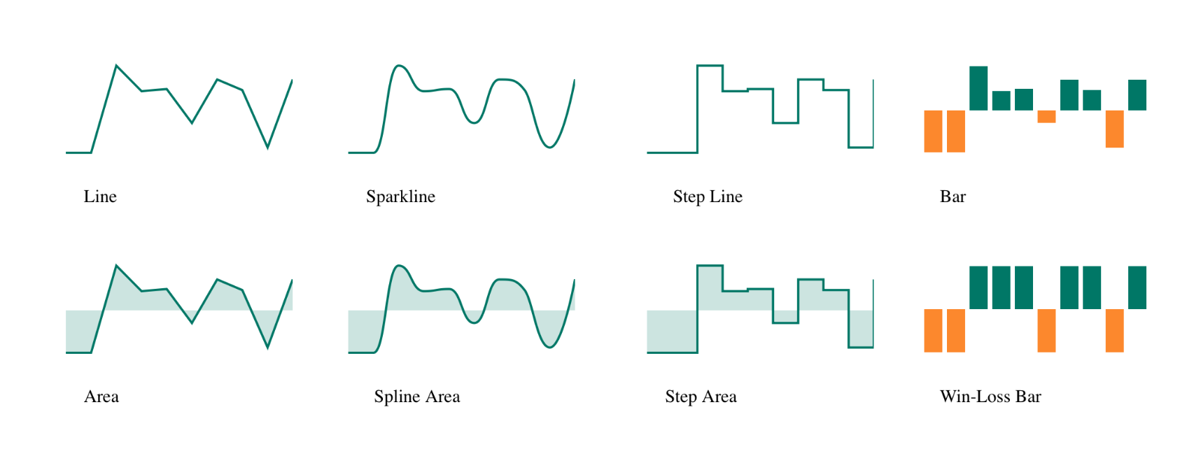
The sparkline widget displays a compact, simplified chart visualizing data variation and general trend shape. It provides rapid operational context in a condensed format for your Apps without occupying the screen space of a full chart.
## Data binding
### Function output or modifier to widget
| **Property** | **Description** | **Type** |
| ------------ | -------------------------------------------------------------------------- | -------- |
| `data` | An array of data objects plotted sequentially to form the sparkline trend. | array |
#### Automatic configuration
If the array payload is bound without pre-defining the `argumentField` (Argument key) and `valueField` (Value key) in the configuration panel, the widget inspects the incoming data structure. It automatically selects the most probable structural string field for the argument and numeric field for the value and populates the widget settings.
## Configuration
Set the widget's defaults in the settings panel.
All types of sparkline
### Styling
These properties control the core visual geometry of the sparkline.
| **Property** | **Label** | **Description** | **Type** |
| ----------------- | ----------------------------- | ------------------------------------------------------------------------------------------------------------------ | -------- |
| `type` | Type | The layout presentation style of the sparkline graph (options include `line`, `bar`, `area`, `spline`, `winloss`). | string |
| `customizeColors` | Apply customized colors | Overrides default theme palette colors to apply the specific custom colors configured in this panel. | boolean |
| `showFirstLast` | Color in first and last entry | Toggles applying a distinct highlight color to the first and last rendered data points. | boolean |
| `firstLastColor` | First and last color | The specific color hex code applied to the first and last data points. | string |
| `showMinMax` | Color in min and max entry | Toggles applying distinct highlight colors to the lowest and highest calculated data points. | boolean |
| `maxColor` | Color of maximum | The specific color hex code applied to the highest recorded data point. | string |
| `minColor` | Color of minimum | The specific color hex code applied to the lowest recorded data point. | string |
| `margin` | Margin | Configuration object defining the internal layout padding around the sparkline (`top`, `bottom`, `left`, `right`). | object |
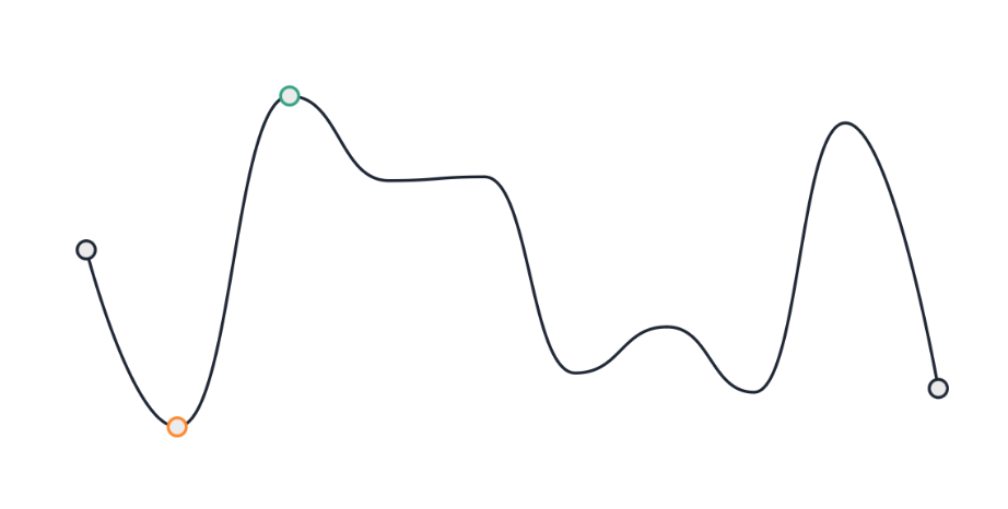
A sparkline with the first, last, minimum and maximum entries marked with points
### Line, area, and spline options
These properties apply specifically when the **Type** is set to a continuous plot like `line`, `area`, or `spline`.
| **Property** | **Label** | **Description** | **Type** |
| ------------- | -------------------- | ------------------------------------------------------------------------------------------------------ | -------- |
| `pointColor` | Point color | The specific color hex code used for the individual data point markers along the continuous line. | string |
| `pointSize` | Point size in pixels | The visual diameter thickness size of the data point markers. | integer |
| `pointSymbol` | Point symbol | The geometric layout shape of the data point markers (options include `circle`, `square`, `triangle`). | string |
| `lineColor` | Line color | The primary stroke color hex code of the continuous main line. | string |
| `lineWidth` | Line width | The thickness dimension of the continuous main line in pixels. | number |
### Bar options
These properties apply specifically when the **Type** is set to `bar`.
| **Property** | **Label** | **Description** | **Type** |
| ------------------ | ------------------ | ------------------------------------------------------------------------------------- | -------- |
| `barNegativeColor` | Negative bar color | The fill color hex code applied to bar columns falling below the baseline (negative). | string |
| `barPositiveColor` | Positive bar color | The fill color hex code applied to bar columns rising above the baseline (positive). | string |
### Win-loss options
These properties apply specifically when the **Type** is set to the binary `winloss` format.
| **Property** | **Label** | **Description** | **Type** |
| ------------------ | ------------------ | ------------------------------------------------------------------------------------------------ | -------- |
| `winColor` | Win color | The fill color hex code applied to column bars recording a value above the configured threshold. | string |
| `lossColor` | Loss color | The fill color hex code applied to column bars recording a value below the configured threshold. | string |
| `winlossThreshold` | Win-loss threshold | The mathematical baseline value used to separate positive wins from negative losses. | number |
### Tooltip settings
These nested properties control the interactive popup behavior on user hover.
| **Property** | **Label** | **Description** | **Type** |
| -------------- | -------------- | --------------------------------------------------------------------------------------------------------- | -------- |
| `enabled` | Enabled | Toggles the layout visibility of the tooltip popup container. | boolean |
| `interactive` | Interactive | Unlocks cursor selection allowing users to highlight and copy tooltip text block content. | boolean |
| `color` | Color | Sets the primary background fill color of the tooltip container. | string |
| `cornerRadius` | Border radius | Sets the pixel dimension curvature applied to the tooltip container edges. | number |
| `opacity` | Opacity | Modifies the alpha transparency channel of the tooltip block from `0` (clear) to `1` (solid). | number |
| `border` | Tooltip border | Configuration object governing the external layout stroke of the container (`color`, `width`, `visible`). | object |
| `font` | Tooltip font | Configuration object governing the typographical text profile of the values (`color`, `size`, `weight`). | object |
### Data fields
These properties map the incoming payload structure boundaries.
| **Property** | **Label** | **Description** | **Type** |
| ------------------- | ------------------------ | --------------------------------------------------------------------------------- | -------- |
| `argumentField` | Argument key | The data object field name defining the horizontal axis sequence steps. | string |
| `valueField` | Value key | The data object field name defining the vertical axis height measurements. | string |
| `ignoreEmptyPoints` | Ignore empty data points | Excludes missing or null data records from the visual plot flow when set to true. | boolean |
| `maxValue` | Maximum of value axis | Defines a rigid, fixed upper limit cap for the vertical drawing axis bounds. | number |
| `minValue` | Minimum of value axis | Defines a rigid, fixed lower limit floor for the vertical drawing axis bounds. | number |
---
# Agent Instructions
This documentation is published with GitBook. GitBook is the documentation platform designed so that both humans and AI agents can read, navigate, and reason over technical content effectively. Learn more at gitbook.com.
## Querying This Documentation
If you need additional information that is not directly available in this page, you can query the documentation by asking a question.
Perform an HTTP GET request on the following URL with the `ask` and `goal` query parameters:
```
GET https://docs.heisenware.com/app-builder/build-frontend/widgets/display-widgets/sparkline.md?ask=&goal=
```
`ask` is the immediate question: it should be specific, self-contained, and written in natural language.
`goal` is what the user is ultimately trying to achieve, the reason they need the answer. Sharing it helps GitBook give you a better, more relevant answer. A goal is most helpful when it describes the outcome the user wants rather than restating the question. For example, with `ask=how do I create an API token`, a goal like `automate deployments from our CI pipeline` lets GitBook tailor the answer to that use case.
The response will contain a direct answer to the question and relevant excerpts and sources from the documentation.
Use this mechanism when the answer is not explicitly present in the current page, you need clarification or additional context, or you want to retrieve related documentation sections.