> For the complete documentation index, see [llms.txt](https://docs.heisenware.com/llms.txt). Markdown versions of documentation pages are available by appending `.md` to page URLs; this page is available as [Markdown](https://docs.heisenware.com/app-builder/build-frontend/widgets/display-widgets/pie-chart.md).
# Pie chart
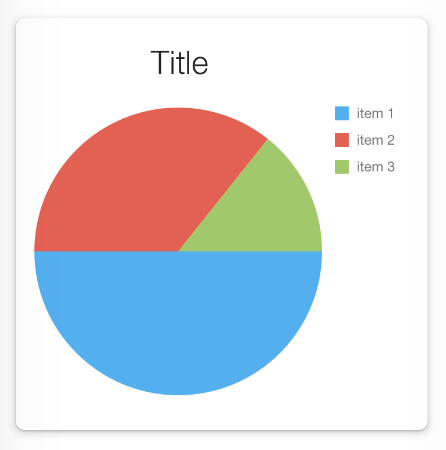
The pie chart widget visualizes proportional data as segments of a circular whole. It displays data arrays as either standard pie slices or a doughnut structure in your Apps.
A pie chart
## Data binding
### Function output or modifier to widget
| **Property** | **Description** | **Type** |
| ------------ | ---------------------------------------------------- | -------- |
| `data` | An array of data objects to be plotted on the chart. | array |
#### Automatic configuration
If an array of objects is bound without pre-defining the `argumentField` (Argument field) and `valueField` (Value field) in the configuration panel, the widget inspects the incoming data structure. It automatically selects the most probable string field for the argument (labels) and the numeric field for the value (sizes) and assigns them to the widget settings.
## Configuration
Set the widget's defaults in the settings panel.
### General settings
| **Property** | **Label** | **Description** | **Type** |
| --------------- | -------------- | ------------------------------------------------------------------------------------------------------------------------------ | -------- |
| `title` | Chart title | The text string displayed as a header at the top of the chart canvas. | string |
| `chartType` | Chart type | The visual layout style geometry of the chart (options include `Pie` or `Doughnut`). | string |
| `showTooltips` | Show tooltips | Enables contextual popups showing exact values and arguments when a user hovers over a slice. | boolean |
| `showLabels` | Show labels | Toggles the visibility of permanent text labels attached to each pie slice. | boolean |
| `labelPosition` | Label position | Sets the layout placement anchor of the labels relative to the pie slices (options include `Inside`, `Columns`, or `Outside`). | string |
| `palette` | Palette | Defines a custom array of color codes used to paint the sequential pie slices. | array |
### Legend settings
Configure the chart's legend, which identifies the different data categories.
| **Property** | **Label** | **Description** | **Type** |
| --------------------------- | -------------------- | --------------------------------------------------------------------------------------------------------- | -------- |
| `legendVisible` | Visible | Toggles the layout visibility of the data category legend container. | boolean |
| `legendTitle` | Legend title | The text string displayed as the header of the legend container. | string |
| `legendVerticalAlignment` | Vertical alignment | Sets the vertical placement anchor for the legend block (options include `Top` or `Bottom`). | string |
| `legendHorizontalAlignment` | Horizontal alignment | Sets the horizontal placement anchor for the legend block (options include `Left`, `Center`, or `Right`). | string |
| `legendOrientation` | Orientation | Sets the internal flow direction layout of the legend items (options include `Vertical` or `Horizontal`). | string |
| `legendMarkerSize` | Marker size | Sets the pixel dimension size of the colored status blocks next to the legend text. | integer |
### Data fields
Map the inbound payload structure to the chart geometry axes.
| **Property** | **Label** | **Description** | **Type** |
| --------------- | -------------- | ------------------------------------------------------------------------------------------------------------------ | -------- |
| `argumentField` | Argument field | The key name from your data object that defines the categories or text labels for each slice. | string |
| `valueField` | Value field | The key name from your data object that defines the numeric value controlling the proportional size of each slice. | string |
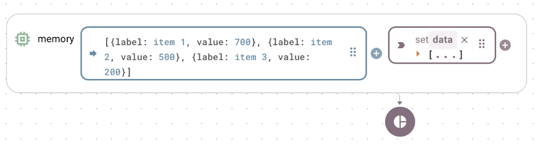
Example input for pie chart shown above
---
# Agent Instructions
This documentation is published with GitBook. GitBook is the documentation platform designed so that both humans and AI agents can read, navigate, and reason over technical content effectively. Learn more at gitbook.com.
## Querying This Documentation
If you need additional information that is not directly available in this page, you can query the documentation by asking a question.
Perform an HTTP GET request on the following URL with the `ask` and `goal` query parameters:
```
GET https://docs.heisenware.com/app-builder/build-frontend/widgets/display-widgets/pie-chart.md?ask=&goal=
```
`ask` is the immediate question: it should be specific, self-contained, and written in natural language.
`goal` is what the user is ultimately trying to achieve, the reason they need the answer. Sharing it helps GitBook give you a better, more relevant answer. A goal is most helpful when it describes the outcome the user wants rather than restating the question. For example, with `ask=how do I create an API token`, a goal like `automate deployments from our CI pipeline` lets GitBook tailor the answer to that use case.
The response will contain a direct answer to the question and relevant excerpts and sources from the documentation.
Use this mechanism when the answer is not explicitly present in the current page, you need clarification or additional context, or you want to retrieve related documentation sections.