> For the complete documentation index, see [llms.txt](https://docs.heisenware.com/llms.txt). Markdown versions of documentation pages are available by appending `.md` to page URLs; this page is available as [Markdown](https://docs.heisenware.com/app-builder/build-frontend/page-explorer.md).
# Page Explorer
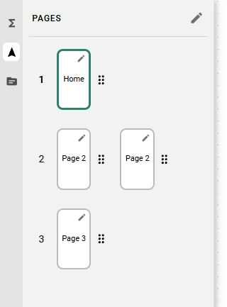
Pages are the individual screens that organize your App's functionality. Heisenware uses a hierarchy of pages and subpages to keep your App structured and easy to navigate. The Page Explorer is also where you configure the App's navigation menu.
Open the Page Explorer by clicking the navigator icon (:location-arrow-up:) on the left panel.
## Managing your App structure
### Page types
* **Pages**: Your top-level screens. By default, they appear in the App's main navigation menu.
* **Subpages**: Nested under a page. They do not appear in the main menu automatically, and are typically used for detail views, settings, or pop-up style content that you link to manually.
### Creating and deleting pages
* **Add/duplicate**: Right-click any page in the panel to create a new page, a subpage, or to duplicate an existing page.
* **Delete**: Right-click any page and click delete. The first page in your App cannot be deleted.
### Reordering pages
Click a page's number and drag it into a new position. The new order carries over to the App's navigation menu.
### Per-page settings
Click the small pencil icon inside a page's representation to open its settings, where you set:
* The page name shown in the menu
* The menu icon
* The app bar title shown at the top of the screen
Subpages inherit the app bar title from their parent page, so users always know which section they are in.
## App menu
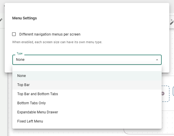
The App menu is the navigation users see across all pages and subpages. To configure it, click the pencil icon next to the `PAGES` label at the top of the Page Explorer.
### Menu types
* **None**: No navigation menu.
* **Top bar**: A bar at the top showing the app bar title and menu icons.
* **Top bar and bottom tabs**: Combines a top bar with a fixed tab bar at the bottom, for a standard mobile App feel.
* **Bottom tabs only**: A fixed tab bar at the bottom of the screen.
* **Expandable menu drawer**: A classic burger menu that opens and closes.
* **Fixed left menu**: A permanent side menu on the left.
### Per-screen menu type
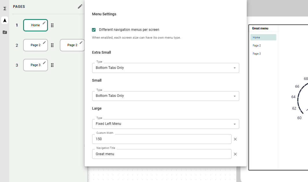
Enable **Different navigation menus per screen** in the App menu settings to give each activated screen size its own menu type. Fixed left menu is often a good choice for large screens, while Bottom tabs only or Expandable menu drawer works well on smaller screens. Switch to the screen size you want to configure in the [Frontend Builder](/app-builder/build-frontend.md), then set the menu type.
Different menu per screen
## Other ways to switch pages
### Widget links
Turn any [button](/app-builder/build-frontend/widgets/trigger-widgets/button.md) or [icon](/app-builder/build-frontend/text-icons-and-images.md) into a page-switch trigger.
* **How to link**: Drag a page from the Page Explorer and drop it directly onto a button or icon on your UI canvas.
* **Use case**: The primary way to let users open subpages (e.g., a "Machine Details" button opening the corresponding detail view) or to navigate in Apps that have no main menu.
### Logic-driven navigation
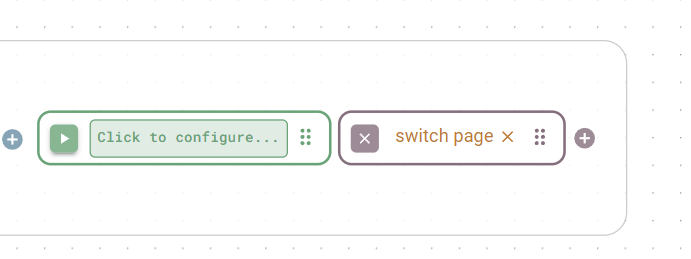
Your backend logic can also switch pages on its own.
* **How to link**: Drag a page from the Page Explorer onto a function's output.
* **Use case**: If a function detects an error or a successful form submission, the backend pushes the user to an error or success page automatically.
Switch page link
{% hint style="info" %}
Need more vertical space on a page? Use the page height setting in the [Frontend Builder toolbar](/app-builder/build-frontend.md#the-toolbar).
{% endhint %}
---
# Agent Instructions
This documentation is published with GitBook. GitBook is the documentation platform designed so that both humans and AI agents can read, navigate, and reason over technical content effectively. Learn more at gitbook.com.
## Querying This Documentation
If you need additional information that is not directly available in this page, you can query the documentation by asking a question.
Perform an HTTP GET request on the following URL with the `ask` and `goal` query parameters:
```
GET https://docs.heisenware.com/app-builder/build-frontend/page-explorer.md?ask=&goal=
```
`ask` is the immediate question: it should be specific, self-contained, and written in natural language.
`goal` is what the user is ultimately trying to achieve, the reason they need the answer. Sharing it helps GitBook give you a better, more relevant answer. A goal is most helpful when it describes the outcome the user wants rather than restating the question. For example, with `ask=how do I create an API token`, a goal like `automate deployments from our CI pipeline` lets GitBook tailor the answer to that use case.
The response will contain a direct answer to the question and relevant excerpts and sources from the documentation.
Use this mechanism when the answer is not explicitly present in the current page, you need clarification or additional context, or you want to retrieve related documentation sections.