> For the complete documentation index, see [llms.txt](https://docs.heisenware.com/llms.txt). Markdown versions of documentation pages are available by appending `.md` to page URLs; this page is available as [Markdown](https://docs.heisenware.com/app-builder/build-frontend.md).
# Build frontend
The UI is what users of your Apps see and interact with. It ranges from simple dashboards and data visualizations to interactive Apps for user input, file management, and more.
{% hint style="info" %}
#### Optional user interface
The UI is optional. You can build headless Apps that use pure backend logic, like a data bridge between a PLC and a SQL database, running silently with no visual frontend.
{% endhint %}
## Core UI components
* [**Widgets**](/app-builder/build-frontend/widgets.md): The functional components of your App. They display live data, capture user input, or trigger logic.
* [**Pages**](/app-builder/build-frontend/page-explorer.md): The individual screens of your App. Create multiple pages and subpages to structure your App logically, then configure navigation elements so users can move between them.
* [**Text, icons, and images**](/app-builder/build-frontend/text-icons-and-images.md): Mostly static elements used for branding, instructions, and non-interactive content.
* [**PDF templates**](/app-builder/build-frontend/pdf-template-editor.md): Visual layouts for generating dynamic documents. Map variables onto a document background, then populate them from your backend logic.
* [**Theme**](/app-builder/build-frontend/theme-editor.md): The global visual DNA of your App. Ensures a consistent look across all widgets and pages.
## Frontend Builder
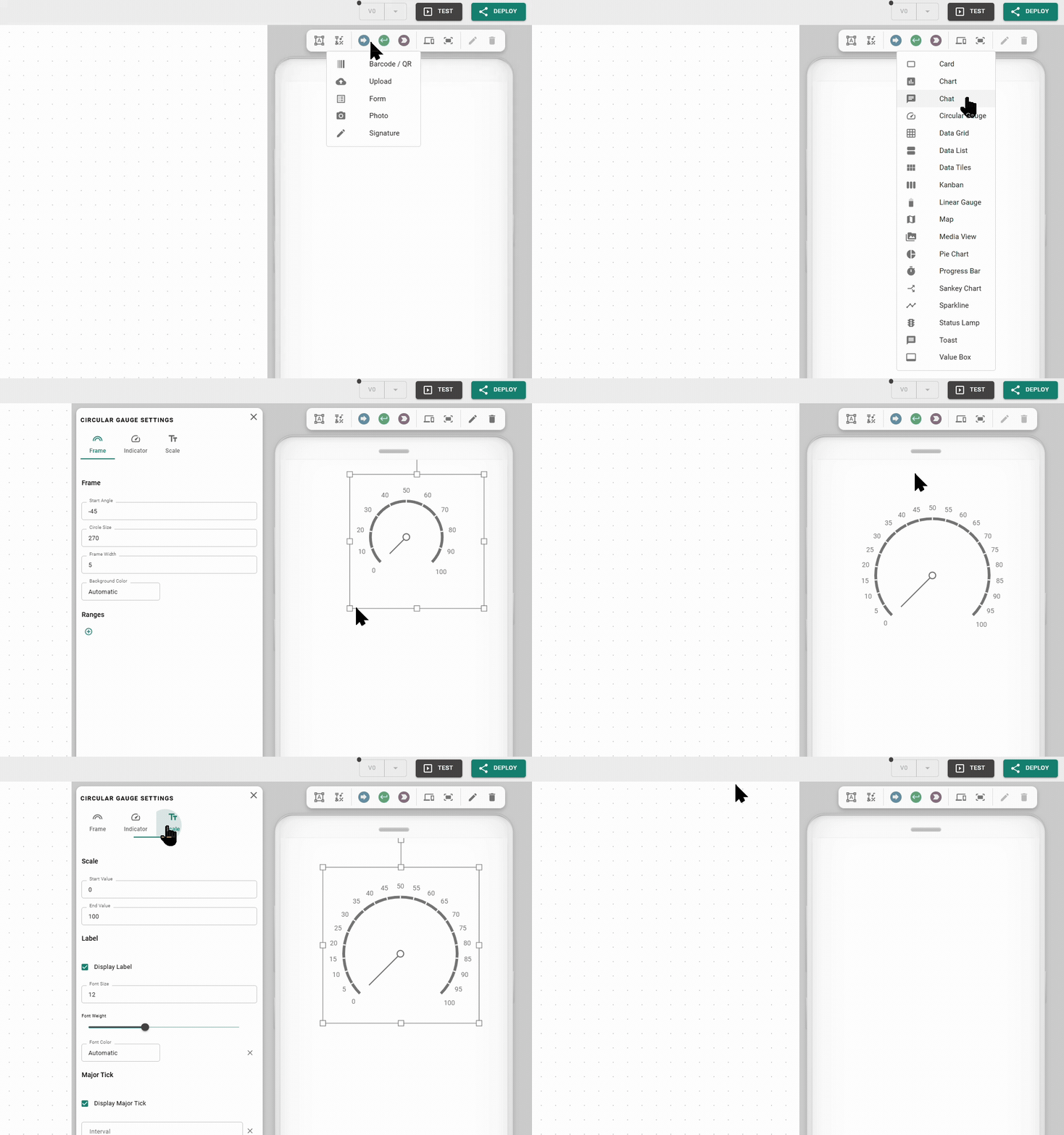
Turn backend logic into a functional, user-facing App inside the Frontend Builder. Place static elements for context and dynamic widgets on each page, then configure them using backend logic.
Build Apps for any screen size and switch the preview as you go to verify that your layout holds up on everything from a smartphone to a large desktop monitor.
### The toolbar
The toolbar serves as your main kit for composing the interface. It holds buttons and icons to:
* Add a text box, icon, or widget.
* Switch the screen preview.
* Extend page height to enable scrolling and scale the view.
* Edit or delete the selected widget. These icons (pen and trash) activate only when you select a widget or UI element.
### Placing and moving elements
Add an element by selecting it from the toolbar and clicking anywhere on the canvas. Once placed, you can:
* **Move**: Drag the element to a new position on the canvas.
* **Resize or rotate**: Use the grab markers on the corners and edges to change the element's dimensions or orientation.
* **Open settings**: Double-click the widget, or select it and click the pen icon in the toolbar.
* **Align with snaplines**: Snaplines appear automatically to help align widgets and other UI elements with each other.
* **Pixel-perfect positioning**: Hold the Shift key while moving an element to temporarily disable snaplines for precise placement.
* **Adjust layers and layout**: Right-click any element to adjust the stacking order of overlapping items, stretch it to full width, or toggle tile view.
Frontend Builder basics
{% hint style="warning" %}
#### Screen-specific layout saving
Heisenware saves changes to an element's position or size per device size. Always check other screen previews to ensure the layout stays clean across all hardware.
{% endhint %}
### Context menu tools
Right-click any element to open a menu for quick layout actions and layer management.
* *Order*: Adjust the stacking of overlapping elements to control which item appears in the foreground or background.
* *Full width*: Instantly stretches the element to fill the entire horizontal space of your current screen preview.
* *Toggle tile view*: Switches the element into a tiled display mode.
### Screen preview and responsive behavior
[Heisenware Apps](/production-apps/overview.md) are responsive by nature and adapt to different screen sizes automatically. Control exactly how your App behaves on different hardware using these toolbar tools:
* **Switching previews**: Click the screens icon (:laptop-mobile:) and click a device icon to switch to the corresponding UI editor and adapt your layout.
* **Enable or disable screens**: Right-click any device icon to enable or disable specific screen sizes. By default, only the phone, tablet, and laptop are active. When a user opens your App on a disabled screen size, Heisenware scales the layout from the nearest active device size.
* **Content alignment (L and XL)**: On large monitors, decide how the overall content sits on the screen. Right-click the L or XL icons to choose between left-aligned or centered layouts.
* **Scaling**: Use the scaling bar to zoom the current preview in or out. This serves as a design-time aid only and does not change the App's actual size for the user.
* **Extend height**: Use the page height icon (:arrows-up-down:) in the toolbar to add vertical space and enable scrolling for the selected device size. This lets you scroll on mobile while keeping a fixed dashboard on desktop. If a page height does not change when you reduce it, a widget is likely positioned outside the valid area. Move or delete that widget first.
{% hint style="info" %}
#### Mobile-first workflow best practices
By default, Heisenware inherits changes upward: changes configured on a smaller screen propagate to larger ones.
1. **Start with phone**: Design your layout for the phone first to ensure your basic structure is solid.
2. **Scale up**: Switch to tablet or laptop views and arrange the widgets to utilize the extra horizontal space.
3. **Fine-tune**: Adjustments on a larger screen stay local to that view, letting you optimize control-room monitors down to the pixel without breaking the mobile experience.
{% endhint %}
---
# Agent Instructions
This documentation is published with GitBook. GitBook is the documentation platform designed so that both humans and AI agents can read, navigate, and reason over technical content effectively. Learn more at gitbook.com.
## Querying This Documentation
If you need additional information that is not directly available in this page, you can query the documentation by asking a question.
Perform an HTTP GET request on the following URL with the `ask` and `goal` query parameters:
```
GET https://docs.heisenware.com/app-builder/build-frontend.md?ask=&goal=
```
`ask` is the immediate question: it should be specific, self-contained, and written in natural language.
`goal` is what the user is ultimately trying to achieve, the reason they need the answer. Sharing it helps GitBook give you a better, more relevant answer. A goal is most helpful when it describes the outcome the user wants rather than restating the question. For example, with `ask=how do I create an API token`, a goal like `automate deployments from our CI pipeline` lets GitBook tailor the answer to that use case.
The response will contain a direct answer to the question and relevant excerpts and sources from the documentation.
Use this mechanism when the answer is not explicitly present in the current page, you need clarification or additional context, or you want to retrieve related documentation sections.

.png?alt=media)
.png?alt=media)